successes
Data Visualization: Dashboards in the Health Sciences Curriculum
Collecting data throughout the curriculum has long been a popular practice in healthcare education programs. As someone who has spent years aggregating and analyzing this data I had one primary goal: putting decision-makers in a position to make informed, actionable decisions to improve our school. Unfortunately, the processes of gathering the necessary data points from several sources throughout our programs can be long and tedious. Overcoming this challenge is vital to producing decisions that have a timely influence on the curriculum and our students.
Timely aggregation of curricular data is a key component of making changes that can positively affect curriculum in real time, including having an influence on the learning experience for current students. Fortunately, the time has come for this key information to be brought to us with data visualization dashboards. With dashboards, the curricular information we receive is effectively illustrated and quickly and easily shared—helping us address issues during the current semester much faster than ever before.
Here are five ways data visualization dashboards can help you make informed decisions:
Curriculum mapping quality
If you’re reading this post, you already know the important role curriculum mapping plays in accreditation and curriculum delivery. You also know the amount of time one can spend maintaining the perpetual work in progress that is a well-mapped curriculum. As courses and instructional methods evolve, we need to make sure our mapping keeps pace to appropriately reflect these changes.

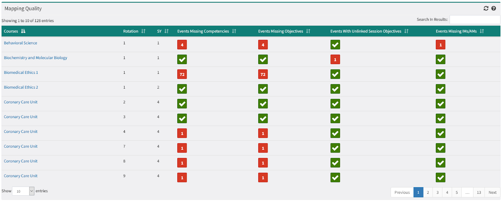
With a curriculum mapping dashboard, any areas of concern in your mapping are brought to you. It really is that simple! Each sortable column quickly lets you know which courses are missing mapping elements, including the exact number of unmapped items. A single click on the course name takes you directly to the events that need a little mapping attention so you can make a quick, no-hassle fix. Leo’s Insights Dashboard keeps you constantly in-the-know so you never have to search for that pesky unmapped competency or instructional method again.
Faculty workload
Much is asked of faculty in healthcare education programs, including direct instructional hours with students. Leo’s data visualization allows administration to be continuously aware of which faculty members have the heaviest classroom workloads each week. With this valuable tool, administrators now have timely and relevant information to set deadlines and expectations for instructor tasks.

Days until important events
Match day. Finals week. Students’ deadline for their clerkship rankings ... the academic year has a number of important dates and deadlines. Having all stakeholders acutely aware of when these major events and deadlines are upcoming is both simple and powerful. Having the subtle, yet frequent reminder of a key deadline helps make sure we are appropriately prepared when the date arrives.
Recent instructional events
From didactic lectures to hands-on clinical experiences, healthcare education students are engaged and assessed using various instructional methods. As we continue to emphasize engaging students with course content and providing formative feedback, it’s important to track exactly how often we’re creating active learning environments. The Insights Dashboard provides data on which teaching methods are being implemented each week, including how many times they are being used. So, if you’re one of the many programs moving away from lecture-based instruction, you can quickly ensure students are being taught with more active teaching methods without having to click into a single course page or schedule.
Leo utilization
Student access of course materials is a clear indicator of curricular engagement, and we all know having students engaged with content and assessments is vital to any successful curriculum. Leo’s Dashboard keeps you in-the-know with how often students are logging in, accessing study materials, and completing evaluations. The power of the Insights Dashboard quickly allows you to identify any concerning student access trends before they manifest in poor academic performance.
The search for data no longer has to slow down your ability to take action in our programs. With the Insights Dashboard, key data points from curriculum mapping to teaching methods are brought directly to you. This data visualization within multiple facets of your curriculum, provides you the information needed to make actionable decisions to improve your program.


